BACK
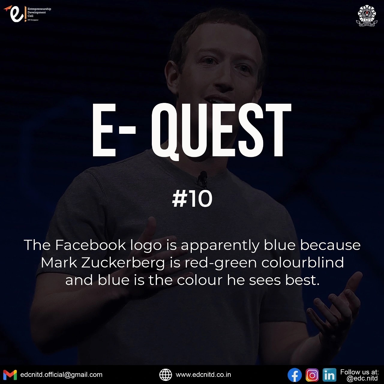
E-Quest #10

The Facebook logo is apparently blue because Mark Zuckerberg is red-green colourblind and blue is the colour he sees best. This makes the site more accessible to the individuals with a similar disability, and hence paved the way for the incorporation of a similar colour scheme in various sites, post the inception of Facebook. However, if we delve deeper into the science behind colour theory, blue evokes a sense of credibility, trust and security in the minds of consumers and hence works best for conglomerates specializing in products related to technology.
